

There’s something magical about pulling into your driveway and feeling an instant wave of pride wash over you. Your home isn’t just a structure, it’s the backdrop of your entire life, the place where memories are made and comfort begins the moment you walk through the door. If your exterior brick feels tired, dated, or just “meh,” a fresh coat of paint can completely reinvent the way your house feels, both to you and to everyone who drives by.
Exterior brick paint color ideas have exploded in popularity because they offer an affordable, dramatic way to upgrade curb appeal without a full renovation. Whether you’re dreaming of a moody charcoal facade, a soft creamy white cottage vibe, or a bold color statement that turns heads, this list has something for every taste and every budget. Get cozy, because you’re about to fall in love with your home all over again, and trust me, you’ll absolutely love idea #9.
1. Classic Crisp White
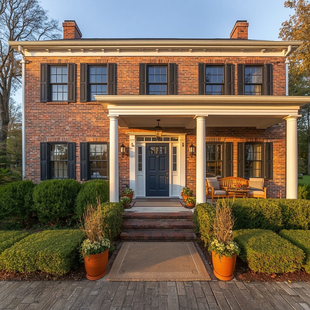
Crisp white brick has become the golden standard for homeowners craving that European cottage, farmhouse-meets-modern look. It brightens the entire property instantly, making the home appear larger, cleaner, and more inviting from the street. White reflects light beautifully, which means your home practically glows during sunrise and sunset, creating that dreamy, Instagram-worthy curb appeal everyone is chasing right now. Pair it with black shutters, a wood door, or greenery for contrast that feels both classic and fresh, and you’ll never tire of how effortlessly elegant it looks in every season.
There’s a reason white brick homes dominate Pinterest boards and real estate listings alike, they photograph beautifully and feel warm rather than cold or sterile. This shade works with nearly any architectural style, from historic colonials to modern farmhouses, making it the safest yet most transformative choice on this list. Add warm brass hardware, natural wood accents, and lush landscaping, and your home will feel like a page torn straight from a coastal design magazine. Crisp white isn’t just a color, it’s a feeling of fresh starts and effortless charm.
2. Warm Greige Elegance
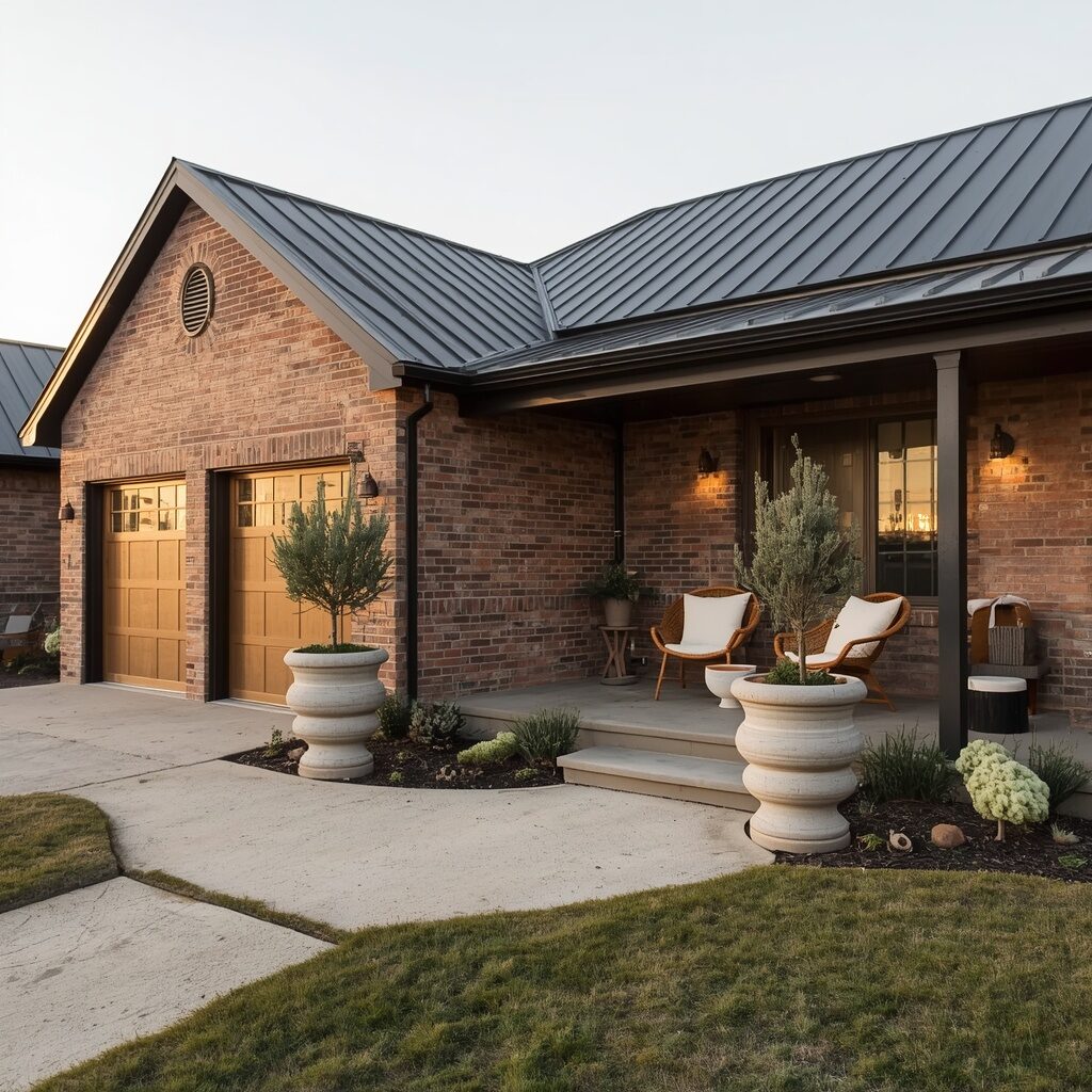
Greige has taken over interior design for years, and now it’s making its way onto exterior brick with stunning results. This warm gray-beige hybrid gives your home a soft, sophisticated look that feels neither too cold nor too beige, striking the perfect balance homeowners crave. It pairs beautifully with warm wood tones, black accents, and natural stone, making it incredibly versatile for almost any style of home. The subtle undertones shift gently throughout the day, giving your brick exterior a rich, dimensional quality that flat colors simply can’t achieve.
What makes greige so beloved is its ability to feel calming and grounded while still looking undeniably expensive and intentional. It’s the kind of color that quietly says “we have great taste” without ever feeling flashy or trend-obsessed. Homeowners love pairing this shade with warm brass lighting fixtures, natural wood doors, and soft green landscaping for a cohesive, elevated look. If you want your home to feel like a peaceful retreat the moment you pull up, warm greige elegance delivers that soothing, sophisticated energy every single time.
3. Moody Charcoal Drama
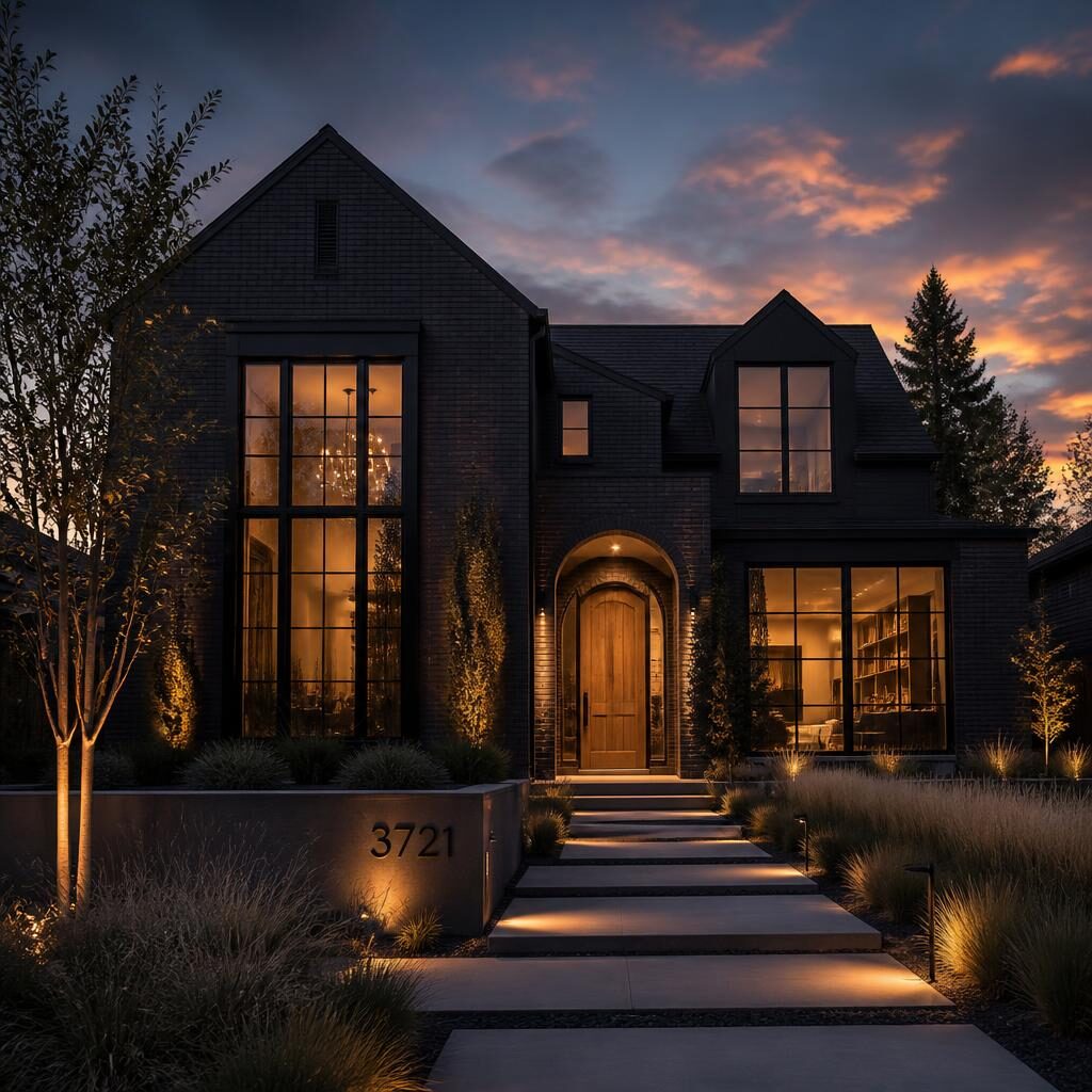
If you want your home to feel like a modern architectural statement, charcoal brick paint delivers instant drama and sophistication. This deep, moody shade transforms even the most traditional brick homes into sleek, contemporary showstoppers that photograph incredibly well against any landscape. Charcoal pairs beautifully with warm wood accents, brass fixtures, and greenery, creating striking contrast that feels intentional and design-forward. It’s a color that commands attention without needing anything extra, making your entire property feel like it belongs in an architecture magazine spread.
Charcoal exteriors have surged in popularity because they offer a moodier alternative to the ever-popular white farmhouse look, giving homeowners a way to stand out. This shade hides dirt and weathering exceptionally well, making it a practical choice alongside its striking visual impact. At night, with warm exterior lighting glowing against the dark brick, your home takes on a cozy yet luxurious ambiance that feels straight out of a boutique hotel. If bold and beautiful is your goal, charcoal drama absolutely delivers on every level.
4. Soft Sage Green Cottage
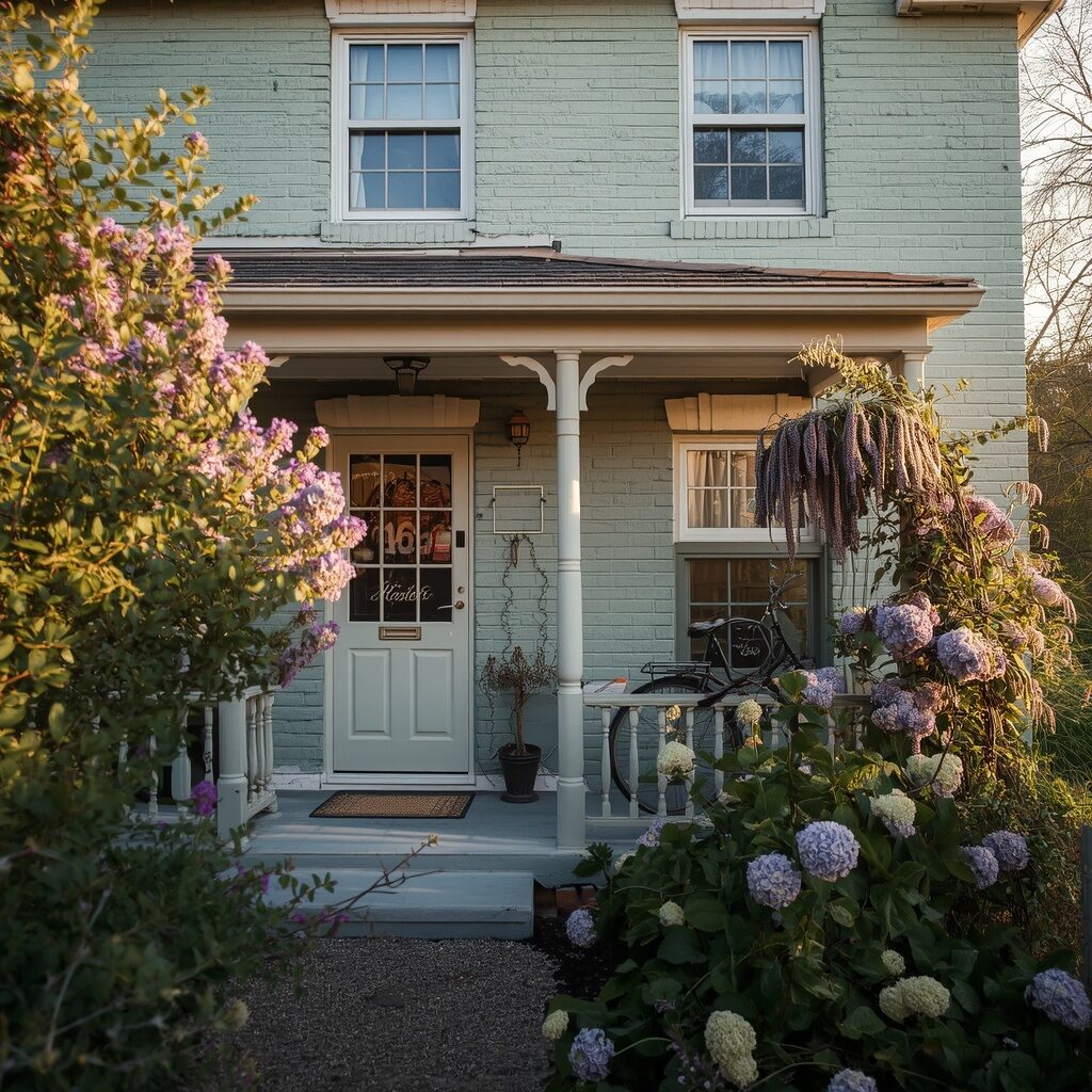
Sage green has become one of the most requested exterior brick colors for homeowners craving a softer, more romantic aesthetic rooted in nature. This muted, earthy tone blends beautifully into garden landscapes, making your home feel like it’s always been part of the natural surroundings. It pairs wonderfully with white trim, wood accents, and abundant greenery, creating that coveted English cottage charm that feels both nostalgic and fresh. The color shifts subtly with the light throughout the day, appearing more gray in shadow and more green in full sun.
This soft, calming shade is perfect for homeowners who want their exterior to feel like a peaceful escape rather than a bold statement piece. Sage green pairs effortlessly with cottage garden landscaping, climbing vines, and vintage-inspired decor elements like iron lanterns or wooden shutters. It’s a color that ages gracefully and never feels overly trendy, making it a long-term investment in your home’s charm and character. If your dream is a storybook cottage feeling every time you come home, soft sage green delivers that magic instantly.
5. Rich Terracotta Warmth
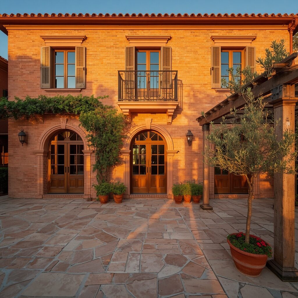
Terracotta brings an instant sense of warmth and vacation energy to any brick exterior, transporting your home to a Mediterranean coastline with just one color choice. This rich, earthy orange-red tone feels sun-baked and inviting, especially when paired with wrought iron details, arched doorways, and lush greenery. It’s a color that photographs beautifully in almost any lighting condition, glowing warmly during golden hour and appearing rich and grounded under midday sun. Homeowners are drawn to terracotta because it feels different, memorable, and undeniably joyful every time they arrive home.
This bold, warm shade works exceptionally well for homes with Spanish, Mediterranean, or desert-inspired architecture, but it’s also being embraced by adventurous homeowners everywhere. Terracotta pairs beautifully with cream trim, black iron accents, and drought-tolerant landscaping like agave and olive trees. It creates an emotional connection to travel, sunshine, and relaxation, making your home feel like a permanent vacation destination. If you’re craving warmth, personality, and a color that truly stands out from every neighboring house, rich terracotta warmth is calling your name.
👉 ✨ Keep scrolling, the next ideas get even better!
6. Dreamy Blush Pink
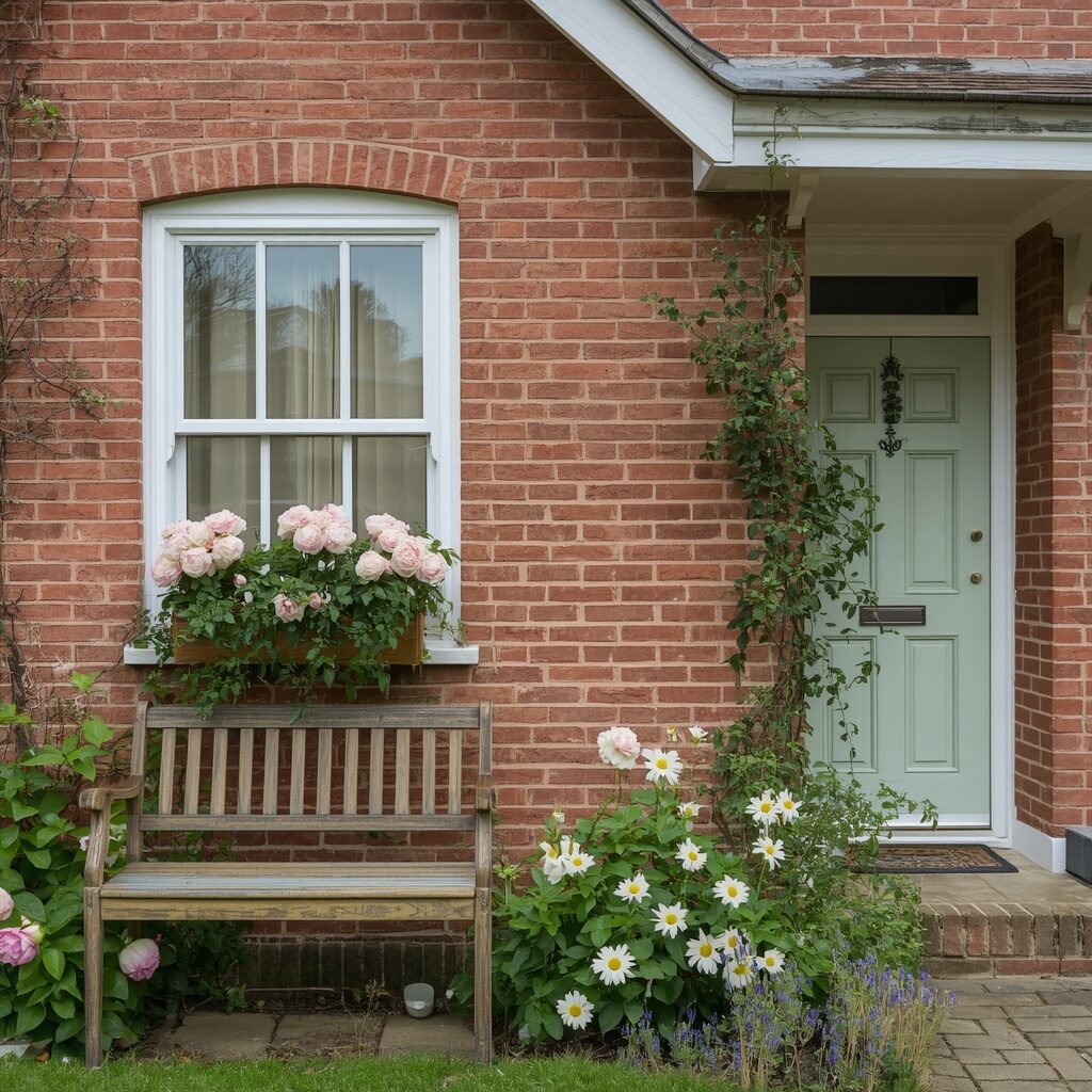
Blush pink might sound unexpected for exterior brick, but this soft, dusty shade has become a beloved choice for homeowners wanting something romantic yet understated. Unlike bright bubblegum pink, this muted blush tone feels sophisticated and grounded, blending beautifully with natural landscaping and neutral trim colors. It creates a soft, welcoming first impression that feels distinctly feminine without being overly sweet or juvenile. Paired with white accents and greenery, blush pink brick delivers a fairytale cottage aesthetic that’s incredibly rare and memorable.
This color choice is trending because it offers a refreshing departure from the sea of white, gray, and black exteriors flooding every neighborhood right now. Blush pink photographs stunningly in both bright sun and soft overcast light, making it a dream for content creators and Pinterest boards alike. It pairs beautifully with brass hardware, wood shutters, and abundant floral landscaping for a cohesive, storybook feel. If you want a home that feels soft, romantic, and completely unforgettable, dreamy blush pink is a bold yet beautiful choice.
7. Deep Navy Sophistication
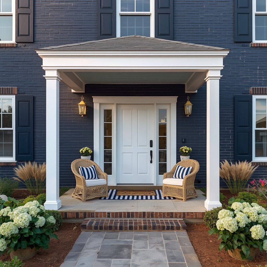
Navy blue brick exteriors bring coastal sophistication and timeless elegance that feels equally at home on the coast or in a suburban neighborhood. This deep, rich color creates striking contrast against white trim, brass fixtures, and natural landscaping, making your home’s architectural details pop beautifully. Navy feels bold without being overwhelming, offering the drama of black with a softer, more approachable undertone that many homeowners find easier to love long-term. It’s a color that photographs beautifully in every lighting condition, from bright midday sun to soft evening glow.
Homeowners are gravitating toward navy because it strikes that perfect balance between classic and contemporary, never feeling dated or overly trendy. This shade pairs beautifully with crisp white trim, natural wood doors, and brass or black hardware for a cohesive, elevated look. Coastal landscaping like hydrangeas, ornamental grasses, and white gravel pathways complement navy brick exceptionally well, creating a cohesive seaside retreat vibe. If you want your home to feel like a permanent vacation destination with timeless sophistication, deep navy delivers that dream every single day.
8. Buttery Cream Comfort
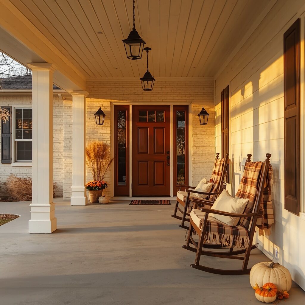
Buttery cream brick offers all the brightness of white with an added layer of warmth that feels instantly cozy and welcoming. This soft, warm neutral avoids the stark coldness that pure white can sometimes carry, making your home feel more like a warm hug than a sterile showroom. It pairs beautifully with warm wood tones, black metal accents, and seasonal decor, transitioning effortlessly from summer greenery to cozy autumn styling. Cream brick has a way of making every season feel photogenic, which is exactly why it performs so well on Pinterest and home inspiration boards.
This shade is especially beloved by farmhouse and cottage-style homeowners who want brightness without sacrificing warmth and comfort. Cream brick pairs exceptionally well with wood front doors, wrought iron lanterns, and layered porch decor featuring natural textures like jute, wicker, and linen. It creates a soft, welcoming glow during golden hour that feels almost cinematic, drawing the eye and creating an emotional connection instantly. If your dream home feels like a warm embrace every time you walk through the door, buttery cream comfort is the perfect exterior choice.
9. Dramatic Black Elegance
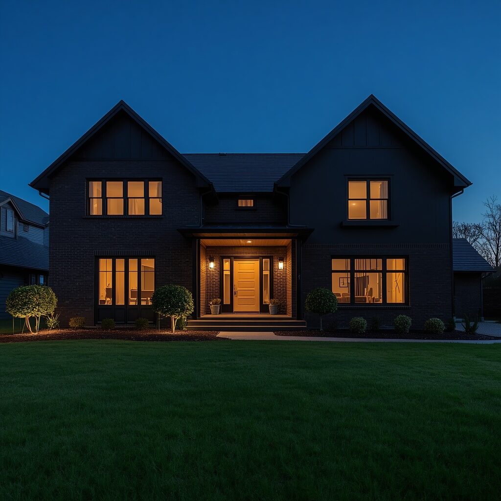
Black brick exteriors have become the ultimate status symbol in modern home design, delivering unmatched drama and sophistication that photographs like pure magic. This bold choice transforms even simple architectural shapes into striking, gallery-worthy silhouettes, especially when captured during golden hour or twilight. Black brick pairs beautifully with warm wood accents, brass or matte black hardware, and minimalist landscaping, creating a cohesive, high-end aesthetic that feels intentional in every detail. It’s a color that never goes unnoticed, turning your entire home into a neighborhood landmark that people slow down to admire.
This is the idea that consistently stops people mid-scroll because black exteriors feel so unexpected, luxurious, and undeniably confident. Black brick hides imperfections beautifully while creating stunning contrast against warm lighting, wood textures, and greenery. Homeowners love pairing this shade with statement lighting fixtures and sculptural landscaping to create a boutique hotel feeling right at home. If you want a home that feels like a bold design statement and an instant Pinterest favorite, dramatic black elegance is absolutely worth the leap.
10. Warm Taupe Tranquility
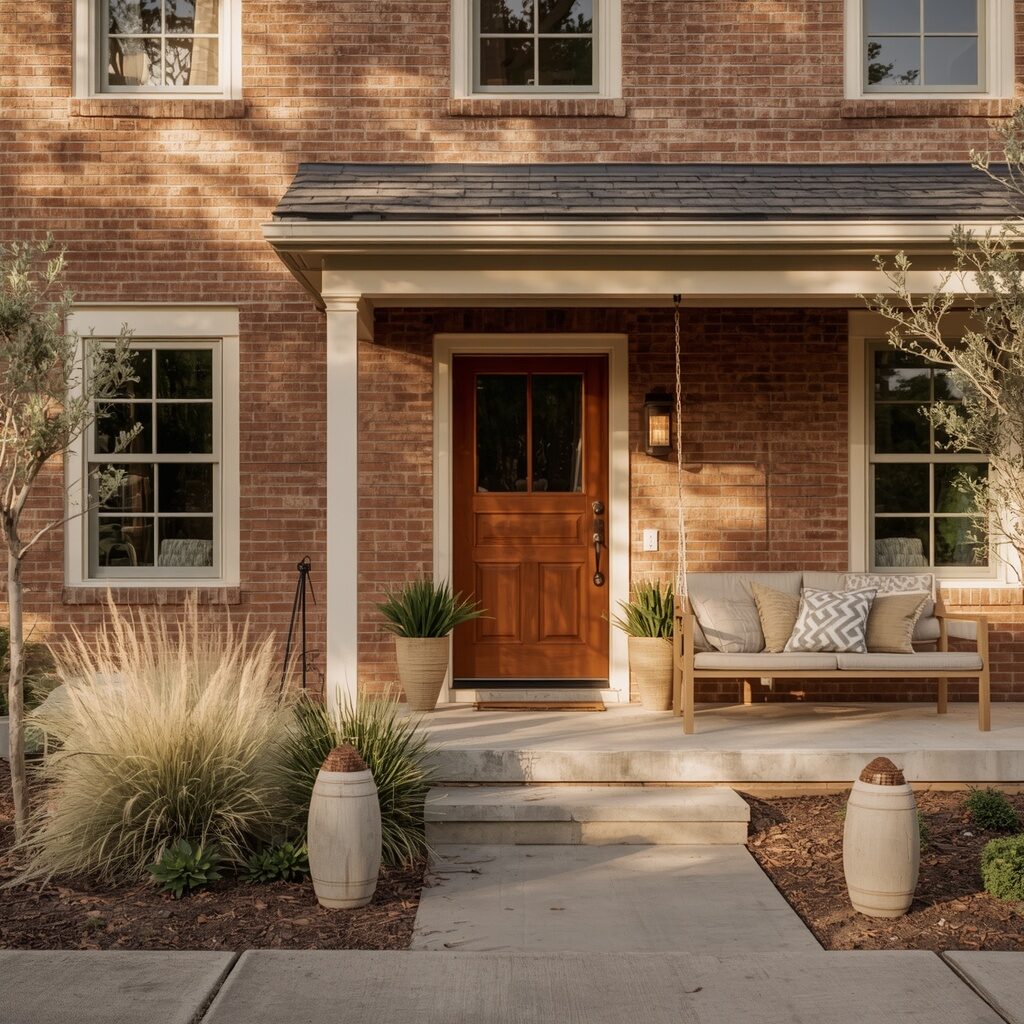
Warm taupe has quietly become one of the most requested exterior brick colors because it delivers understated luxury without ever feeling boring or forgettable. This soft, warm neutral sits perfectly between beige and gray, offering versatility that pairs beautifully with almost any trim color, roofing material, or landscaping style. It creates a calm, grounded first impression that feels intentional and thoughtfully designed rather than trend-chasing. Taupe brick photographs beautifully in natural light, holding warm undertones that make your home feel inviting rather than cold or clinical.
This shade is perfect for homeowners who want their exterior to feel timeless and sophisticated without committing to something too bold or too plain. Warm taupe pairs exceptionally well with cream trim, wood accents, and soft neutral landscaping for a cohesive, calming aesthetic. It ages gracefully over time, never feeling dated the way some trendier colors eventually do. If your goal is quiet luxury and a home that feels effortlessly put-together every single day, warm taupe tranquility is an incredibly smart and beautiful choice.
👉 ✨ Keep scrolling, the next ideas get even better!
11. Coastal Seafoam Green
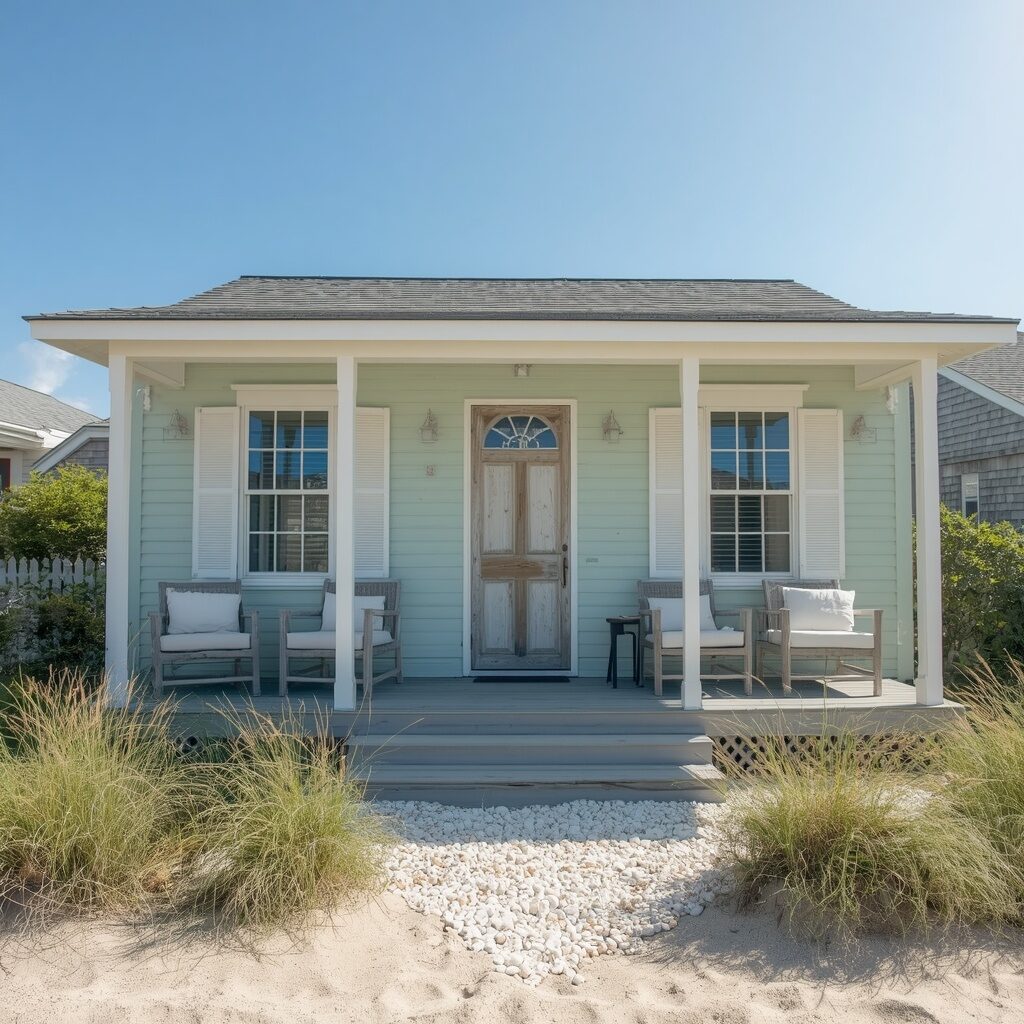
Seafoam green brings breezy beach-house energy to any brick exterior, instantly evoking feelings of salty air and relaxed coastal living. This soft, muted green-blue shade feels fresh and calming, especially paired with crisp white trim and natural, weathered wood textures. It’s an incredibly popular choice for coastal homes, but inland homeowners are embracing it too for the vacation-like escape it creates every single day. Seafoam brick photographs beautifully under bright blue skies, creating that dreamy postcard aesthetic that performs exceptionally well on Pinterest.
This shade works wonderfully with beach grass landscaping, driftwood accents, and white or natural rope detailing for a cohesive coastal theme. Seafoam green feels youthful and refreshing without being overly saturated, making it approachable for a wide range of architectural styles beyond just beach cottages. Homeowners love how this color instantly transports them to vacation mode, turning an ordinary Tuesday into a mini mental escape. If your dream is coming home to a permanent seaside retreat feeling, coastal seafoam green delivers that breezy magic effortlessly.
12. Rustic Barn Red
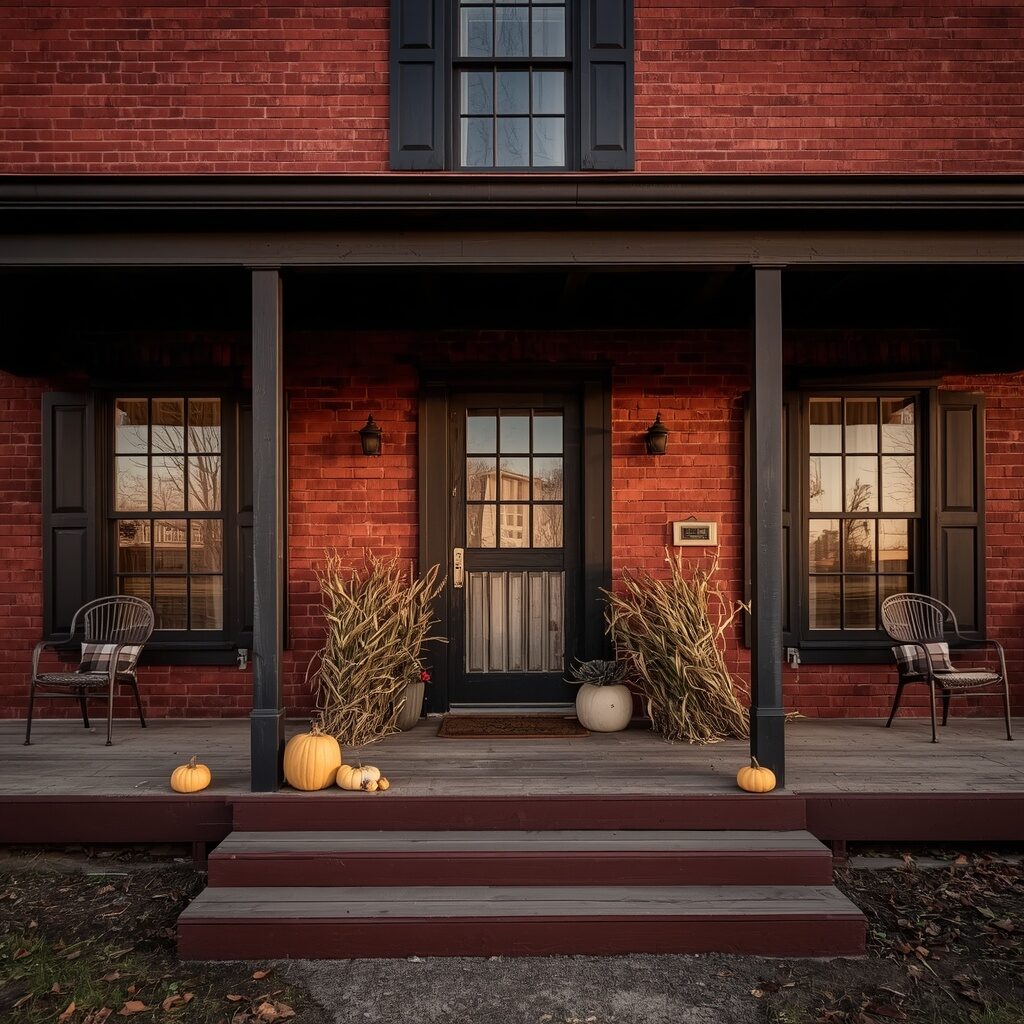
Barn red brick delivers bold, nostalgic charm that instantly transports you to a rustic countryside farmhouse, even in the middle of suburbia. This deep, warm red shade carries incredible character and history, feeling grounded and authentic rather than trendy or fleeting. It pairs beautifully with black trim, weathered wood accents, and vintage-inspired decor elements like metal chairs or antique lanterns. Barn red photographs stunningly during golden hour, when warm light amplifies its rich, earthy tones against a soft evening sky.
This shade is perfect for homeowners craving a home with genuine personality and old-world charm that feels lived-in and loved. Barn red pairs exceptionally well with black metal roofing, wood shutters, and seasonal decor that changes beautifully from summer greenery to autumn harvest displays. It creates an emotional, nostalgic connection to simpler times, making your home feel like a cherished family retreat. If bold character and cozy Americana charm speak to your heart, rustic barn red is an unforgettable exterior choice.
13. Soft Dove Gray
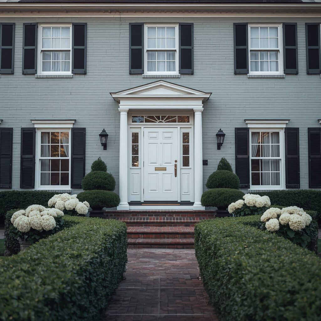
Soft dove gray brings gentle sophistication to exterior brick, offering a lighter, airier alternative to darker charcoal or deep gray tones. This versatile shade complements nearly every architectural style, from traditional colonials to modern farmhouses, making it one of the safest yet most elegant choices available. It pairs beautifully with white trim, black shutters, and brass hardware, creating a classic, polished look that never feels dated or boring. Dove gray photographs beautifully in soft morning light, holding subtle warm and cool undertones depending on the time of day.
This shade is especially popular among homeowners who want elegance without starkness, striking a perfect middle ground between white and charcoal. Dove gray pairs wonderfully with boxwood landscaping, white flowering shrubs, and traditional brick pathways for a cohesive, refined curb appeal. It’s a color that photographs beautifully for real estate listings and Pinterest boards alike, feeling both aspirational and achievable. If your dream is timeless elegance that never goes out of style, soft dove gray is a truly gorgeous and versatile choice.
14. Golden Mustard Accent
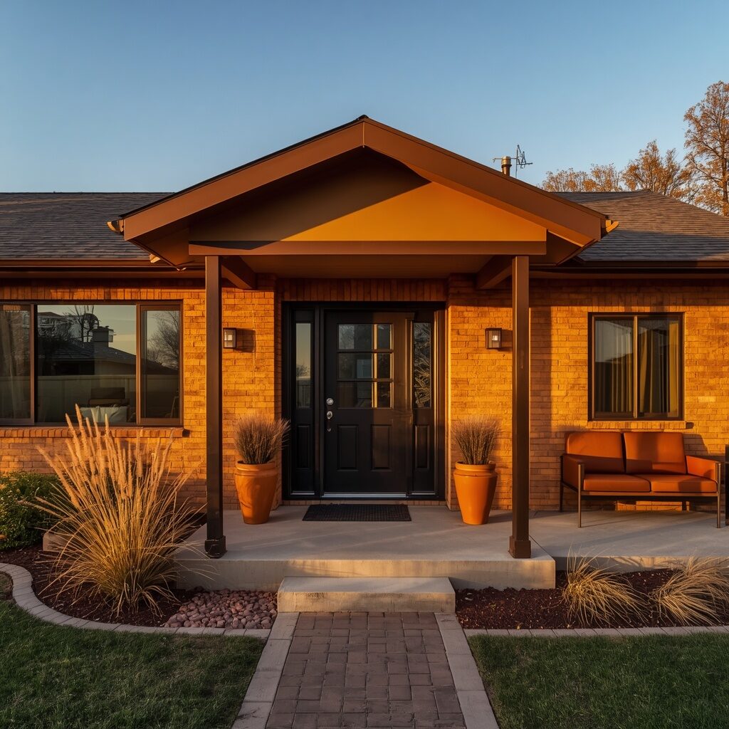
Golden mustard is for the fearless homeowner who wants their brick exterior to feel like a genuine work of art rather than a safe, predictable choice. This warm, sunny shade radiates confidence and energy, especially against dark trim and mid-century modern architectural details. It’s a color choice that instantly sets your home apart from every neutral-toned house on the block, creating serious curb appeal conversation. Mustard brick photographs beautifully in warm afternoon light, glowing with rich, saturated tones that feel vibrant and full of personality.
This bold shade pairs exceptionally well with dark brown or black trim, leather furniture accents, and earthy, textured landscaping like ornamental grasses. It carries strong retro and mid-century charm, making it perfect for homeowners with vintage-inspired architecture or a love for unique design choices. Golden mustard creates an emotional response the moment you see it, sparking joy and curiosity rather than blending into the background. If you’re ready to embrace bold personality and stand out beautifully, golden mustard accent is a genuinely exciting choice.
15. Soft Lavender Whimsy
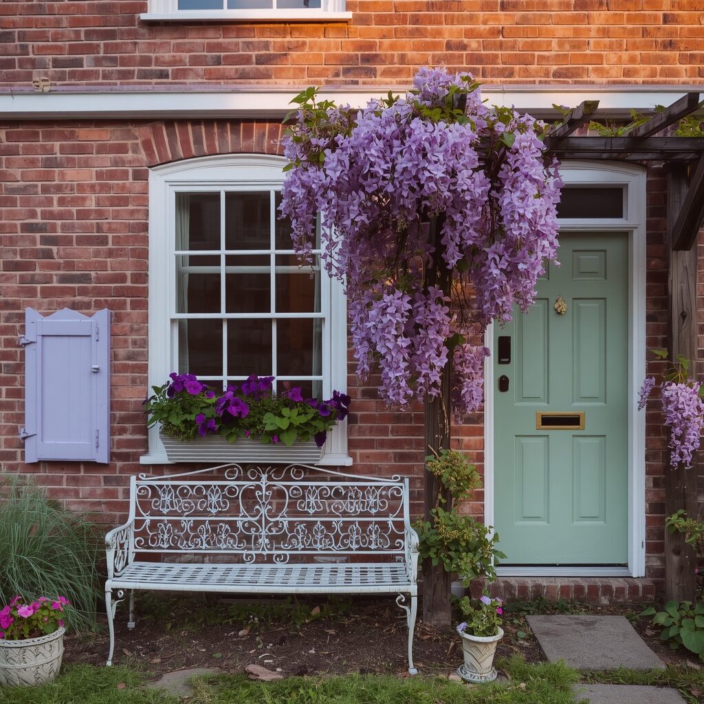
Soft lavender might be the most unexpected color on this entire list, but that’s exactly why it creates such a memorable, scroll-stopping impression. This gentle pastel purple feels dreamy and whimsical, transforming an ordinary brick cottage into something straight out of a fairytale storybook. It pairs beautifully with white trim, sage green accents, and abundant purple or white floral landscaping for a cohesive, romantic garden aesthetic. Lavender brick photographs stunningly during golden hour, when warm light softens the pastel tone into something truly magical and dreamlike.
This color choice is perfect for homeowners who want their exterior to feel joyful, playful, and completely unlike anyone else’s house nearby. Lavender pairs wonderfully with climbing wisteria, vintage iron furniture, and cottage garden landscaping bursting with color and texture. It creates an instant emotional connection, evoking childhood storybooks and dreamy garden fantasies that feel both nostalgic and fresh. If you want a home that feels like pure whimsy and joy every single day, soft lavender whimsy is a delightfully bold and beautiful choice.
👉 ✨ Keep scrolling, the next ideas get even better!
16. Rich Espresso Brown
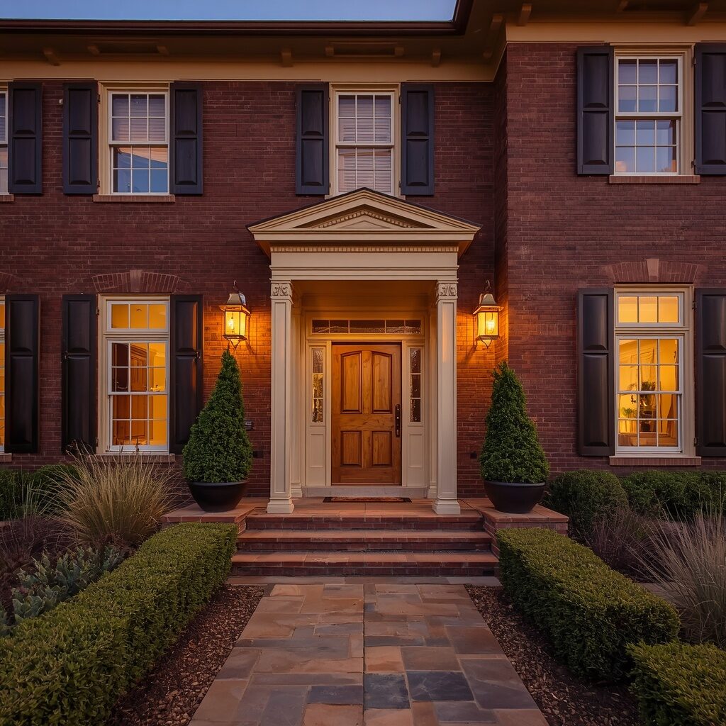
Rich espresso brown brings deep, grounded sophistication to exterior brick, offering warmth and richness without the starkness of true black. This deep chocolate tone feels luxurious and intentional, especially when paired with cream trim, brass hardware, and warm stone landscaping. It’s a color that photographs beautifully in warm evening light, creating a cozy, inviting glow that feels like a five-star boutique retreat. Espresso brown brick carries an understated elegance that whispers luxury rather than shouting it, appealing to homeowners who want sophistication without excessive drama.
This shade pairs exceptionally well with natural wood doors, iron light fixtures, and layered greenery for a cohesive, upscale aesthetic. Espresso brown feels timeless and grounded, never falling into passing design trends the way some bolder colors eventually do. Homeowners are drawn to this shade because it feels warm and welcoming while still carrying serious visual weight and presence. If your dream home feels like quiet luxury wrapped in warmth and richness, rich espresso brown is an exceptional and enduring choice.
17. Icy Powder Blue
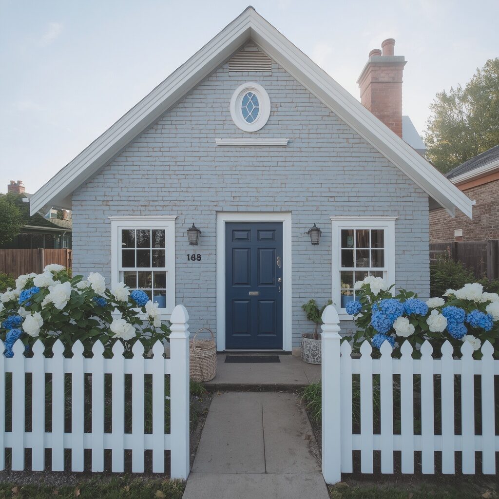
Icy powder blue delivers a fresh, nostalgic charm that feels like stepping into a classic storybook cottage from another era. This soft, pale blue shade feels cool and calming, especially paired with crisp white trim and navy accent details for classic contrast. It’s a color that photographs beautifully under soft morning light, creating that gentle, dreamy aesthetic that performs exceptionally well across Pinterest and home inspiration platforms. Powder blue brick carries a sense of nostalgia and charm, reminiscent of vintage seaside cottages and classic American picket-fence homes.
This shade pairs wonderfully with white picket fences, navy or black shutters, and cottage garden landscaping featuring roses and hydrangeas. It creates an instant emotional pull toward simpler, sweeter times, making your home feel warm, welcoming, and full of character. Powder blue works beautifully across seasons, feeling crisp and fresh in spring while offering a cozy contrast against autumn leaves. If your dream home feels like a page from a classic storybook, icy powder blue is a truly charming and memorable choice.
18. Warm Camel Neutral
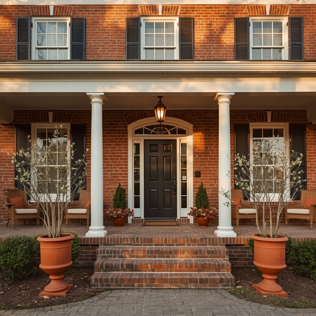
Warm camel brings polished sophistication to exterior brick, offering richness and depth without leaning too dark or too neutral. This warm tan-brown shade feels intentional and elevated, especially paired with crisp white trim and black accent details for striking contrast. It’s a color that photographs beautifully in golden afternoon light, radiating warmth that feels inviting rather than overwhelming. Camel brick carries a quiet confidence, appealing to homeowners who want their exterior to feel expensive and thoughtfully curated without excessive boldness.
This shade pairs exceptionally well with woven porch furniture, terracotta accents, and warm neutral landscaping for a cohesive, chic aesthetic. Camel feels grounded and timeless, working beautifully across traditional, modern farmhouse, and transitional architectural styles alike. Homeowners love how this shade transitions seamlessly between seasons, feeling warm in autumn and fresh in spring and summer. If your goal is polished sophistication that photographs beautifully year-round, warm camel neutral is an incredibly smart and stylish choice.
19. Deep Forest Green
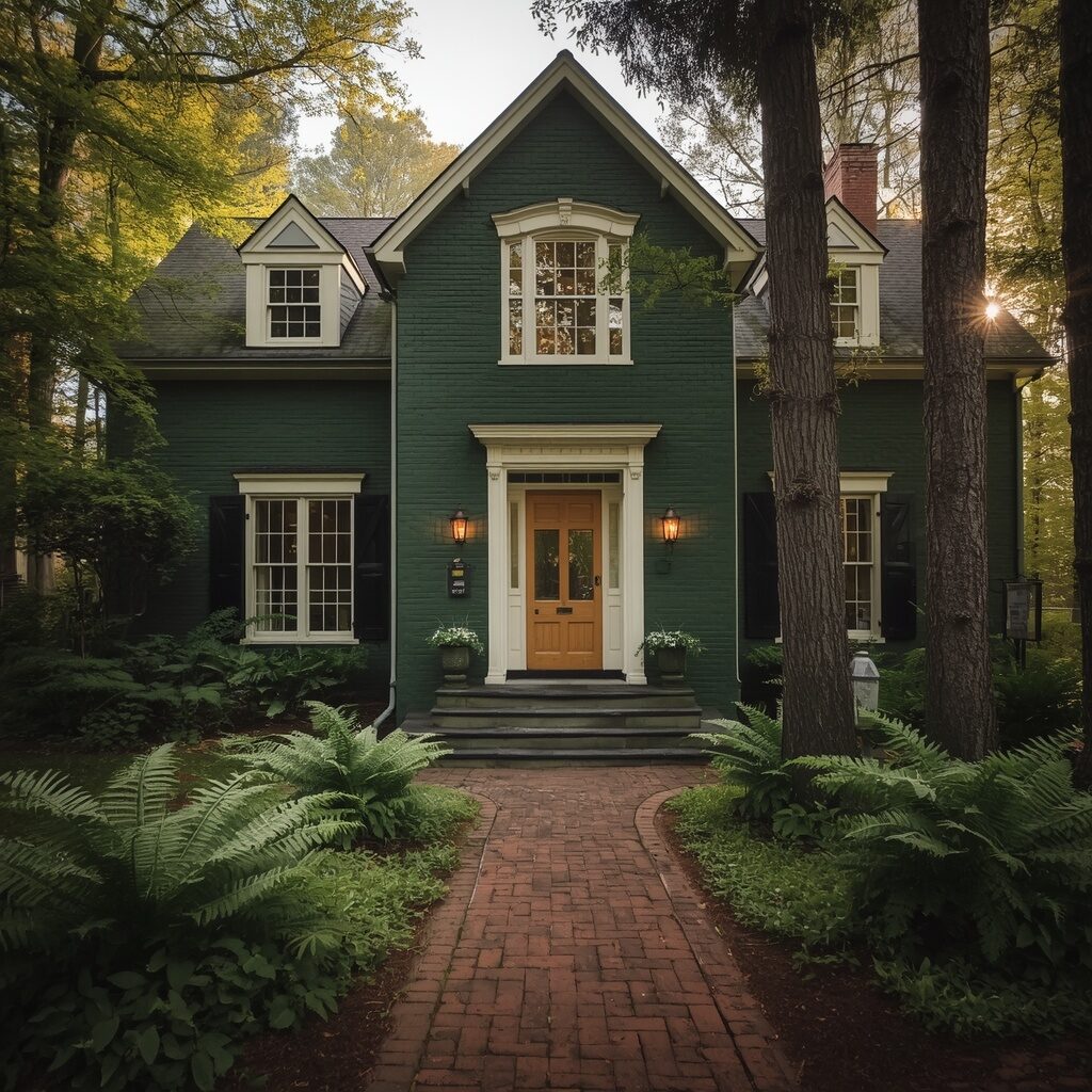
Deep forest green brings rich, grounded luxury to exterior brick, creating a home that feels like a peaceful woodland retreat rather than a typical suburban house. This dark, saturated green pairs beautifully with cream trim, brass fixtures, and natural wood accents, creating warm contrast against the cool, rich backdrop. It’s a color that photographs stunningly when surrounded by trees or lush landscaping, blending seamlessly into nature while still standing out with striking presence. Forest green brick carries a serious, sophisticated energy that feels both bold and completely timeless.
This shade pairs wonderfully with layered greenery, natural stone pathways, and warm brass or wood detailing for a cohesive, nature-inspired aesthetic. Forest green feels particularly stunning during autumn, when surrounding foliage complements the deep tone beautifully for a rich, cohesive seasonal palette. Homeowners are drawn to this shade because it feels grounded, private, and deeply connected to nature, like a retreat tucked away from the world. If a luxurious woodland escape sounds like your dream home, deep forest green delivers that magic in every season.
20. Blush Beige Harmony
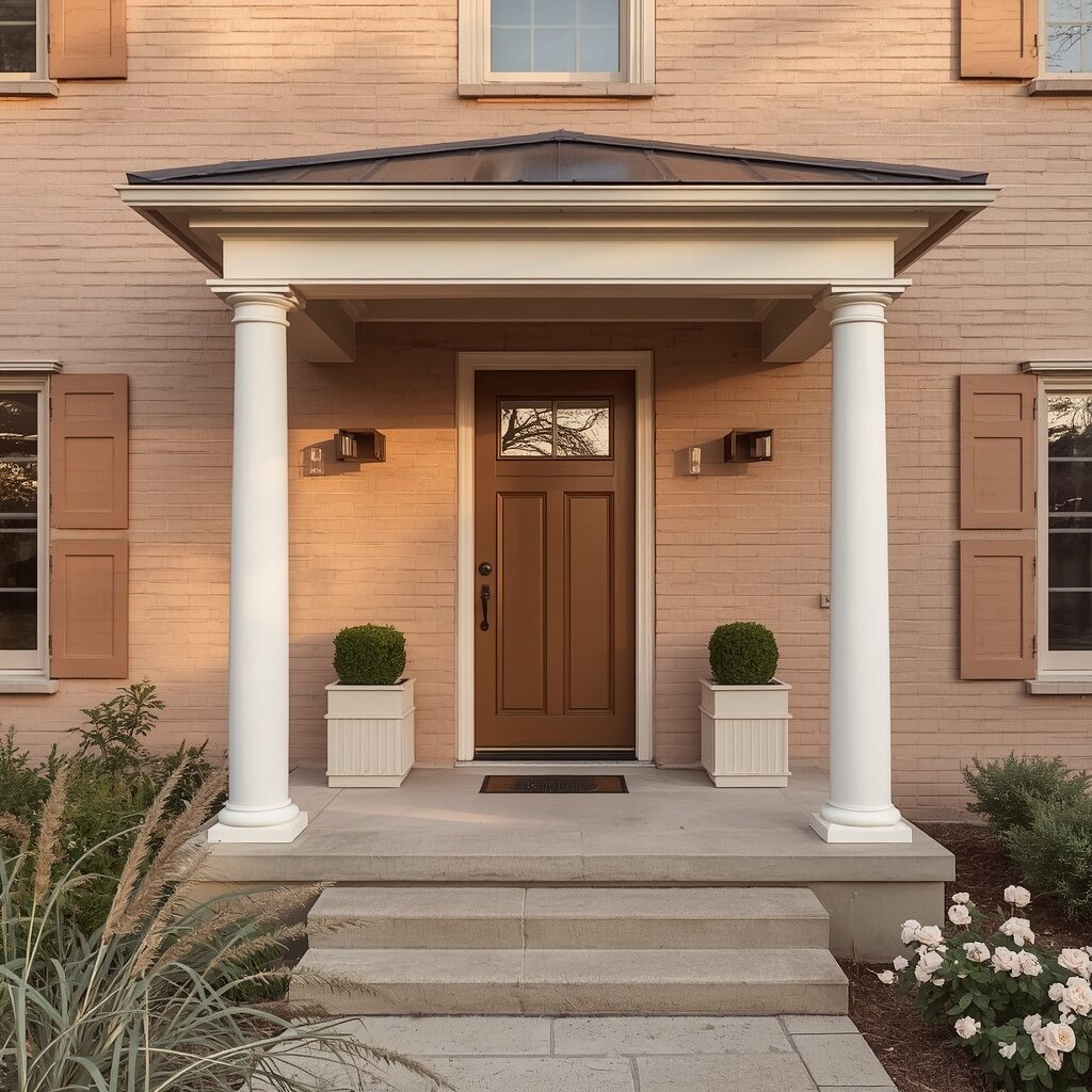
Blush beige combines the softness of pink with the grounded neutrality of beige, creating a harmonious shade that feels calm, elegant, and quietly beautiful. This gentle color offers warmth without the boldness of full blush pink, making it a wonderful choice for homeowners who want subtlety with a hint of personality. It pairs beautifully with cream trim, natural wood accents, and soft pastel landscaping for a cohesive, balanced aesthetic. Blush beige brick photographs beautifully in golden light, holding warm undertones that feel inviting and effortlessly put-together.
This shade appeals to homeowners craving a neutral palette with just a touch of unexpected softness and charm. Blush beige pairs wonderfully with pale pink florals, ornamental grasses, and warm wood detailing for a cohesive, gentle curb appeal. It feels sophisticated without trying too hard, striking that perfect balance between bold and boring that so many homeowners search for. If effortless harmony and quiet elegance define your dream home, blush beige harmony is a beautifully balanced choice worth considering.
👉 ✨ Keep scrolling, the next ideas get even better!
21. Slate Blue Calm
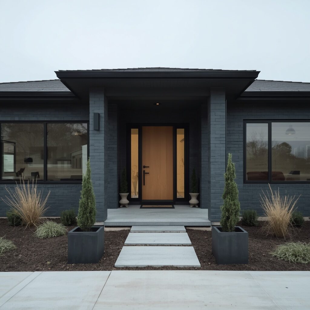
Slate blue offers a cool, contemporary alternative to traditional gray or charcoal exteriors, giving your home a confident yet understated presence. This muted blue-gray shade feels modern and sophisticated, especially paired with black trim, natural wood accents, and minimalist landscaping. It’s a color that photographs beautifully in overcast or soft lighting conditions, holding rich, cool undertones that feel calm rather than cold. Slate blue brick carries a quiet confidence, appealing to homeowners with modern or contemporary architectural styles who want something distinctive yet tasteful.
This shade pairs exceptionally well with matte black hardware, clean landscaping lines, and sleek concrete or stone pathway materials. Slate blue feels particularly at home paired with minimalist design elements, creating a cohesive, architecturally intentional look throughout the property. Homeowners love how this shade feels calm and grounded, offering a peaceful counterbalance to busy daily life the moment they arrive home. If contemporary calm and quiet confidence define your ideal home exterior, slate blue calm is an exceptional and stylish choice.
22. Antique White Charm
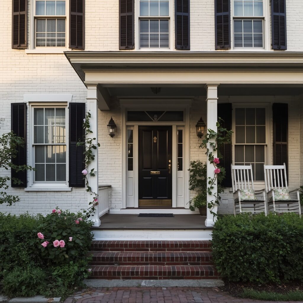
Antique white offers all the elegance of crisp white with a softer, warmer undertone that feels less stark and more historically charming. This gentle off-white shade works beautifully on older homes with traditional architecture, adding warmth without sacrificing brightness or curb appeal. It pairs wonderfully with black shutters, brass hardware, and climbing florals for that coveted old-world cottage aesthetic. Antique white brick photographs beautifully in warm afternoon light, holding subtle cream undertones that feel inviting and lived-in rather than sterile or new.
This shade is especially popular among homeowners restoring historic properties or seeking that timeless, storybook charm without going fully stark white. Antique white pairs exceptionally well with vintage porch furniture, climbing roses, and traditional brick or stone pathway details. It creates a warm, welcoming first impression that feels like generations of love and care have gone into the home. If old-world charm and warm nostalgia define your dream exterior, antique white charm is a beautifully timeless and inviting choice.
23. Bold Teal Statement
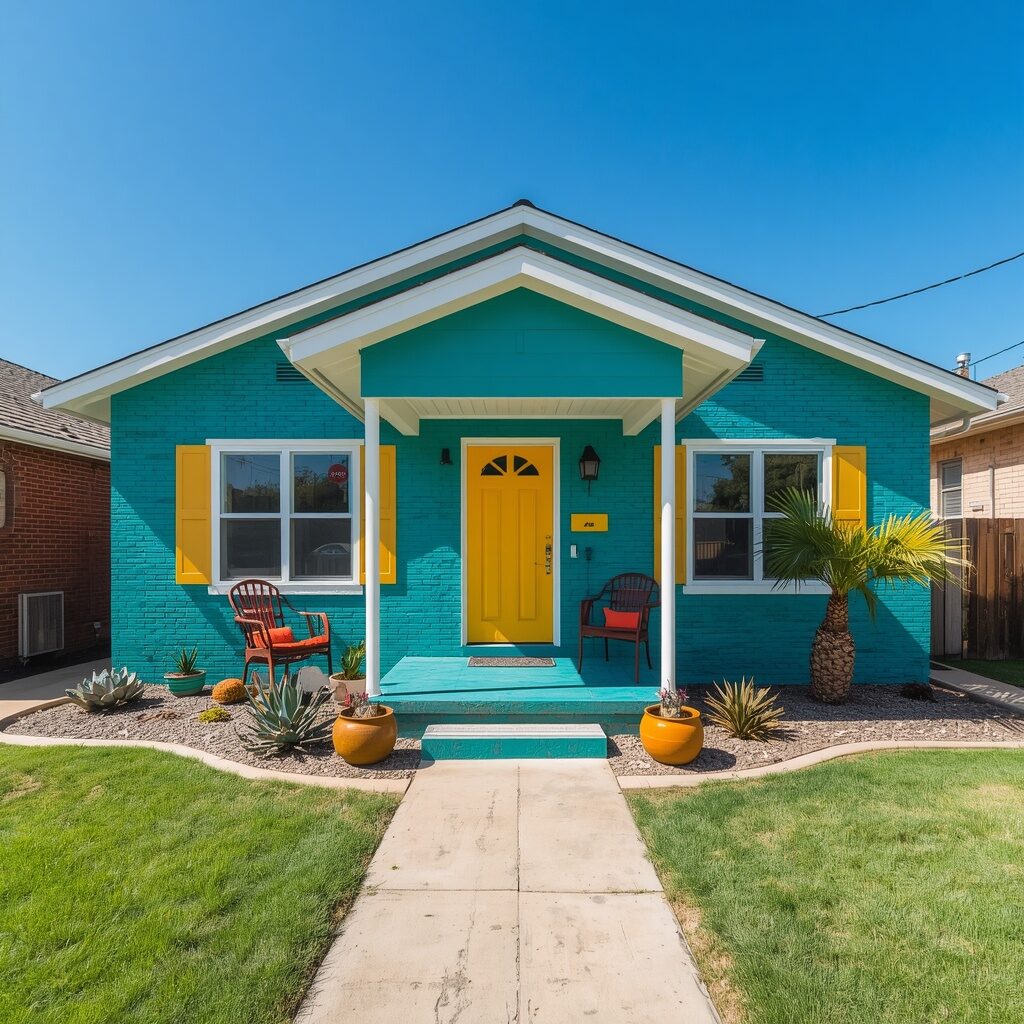
Bold teal is for homeowners who refuse to blend in, delivering vibrant, tropical energy that instantly makes your home the most memorable on the street. This saturated blue-green shade feels playful and confident, especially paired with white trim and warm mustard or wood door accents for striking contrast. It’s a color that photographs incredibly well under bright, sunny skies, radiating vibrant energy that feels youthful and full of personality. Teal brick creates an instant emotional response, sparking joy and curiosity in everyone who passes by your unforgettable facade.
This bold shade pairs wonderfully with mid-century modern furniture, tropical landscaping, and colorful accent pieces throughout the exterior. Teal feels particularly stunning in warm, sunny climates where vibrant colors naturally feel more at home and less out of place. Homeowners choosing this shade want their house to feel like a joyful expression of their personality rather than a safe, predictable choice. If bold color and unapologetic personality define your dream home, bold teal statement is an exciting and unforgettable choice.
24. Warm Almond Neutral
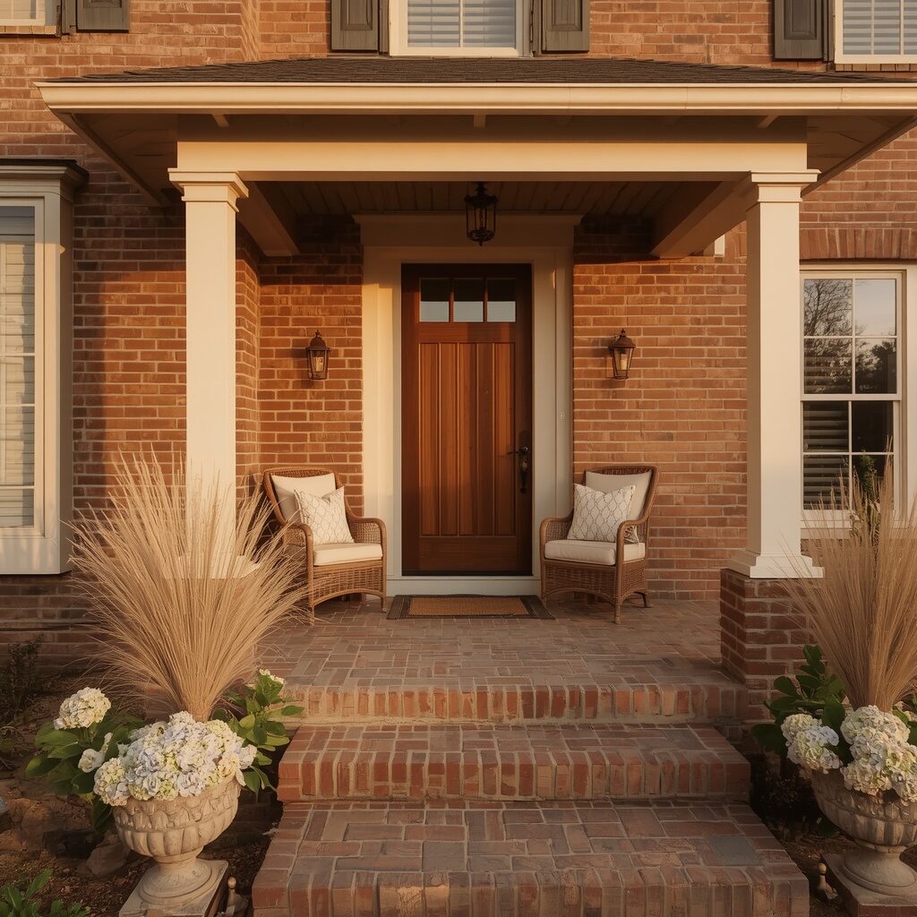
Warm almond brings gentle sophistication and coziness to exterior brick, offering a soft neutral that feels inviting rather than plain or overlooked. This warm, muted tan shade pairs beautifully with cream trim, walnut wood accents, and neutral landscaping for a cohesive, calming aesthetic throughout the property. It photographs beautifully during golden hour, holding warm undertones that create an instant sense of comfort and home. Almond brick appeals to homeowners who want understated elegance with genuine warmth, avoiding both stark whites and overly dramatic dark tones.
This shade pairs wonderfully with woven porch textures, soft floral landscaping, and warm wood detailing for a cozy, welcoming curb appeal. Warm almond feels timeless and versatile, working beautifully across farmhouse, traditional, and transitional architectural styles alike. Homeowners are drawn to this shade because it feels like coming home to a warm hug every single day, regardless of season or weather. If gentle sophistication and cozy warmth define your dream home, warm almond neutral is an exceptionally inviting and beautiful choice.
25. Deep Plum Luxury
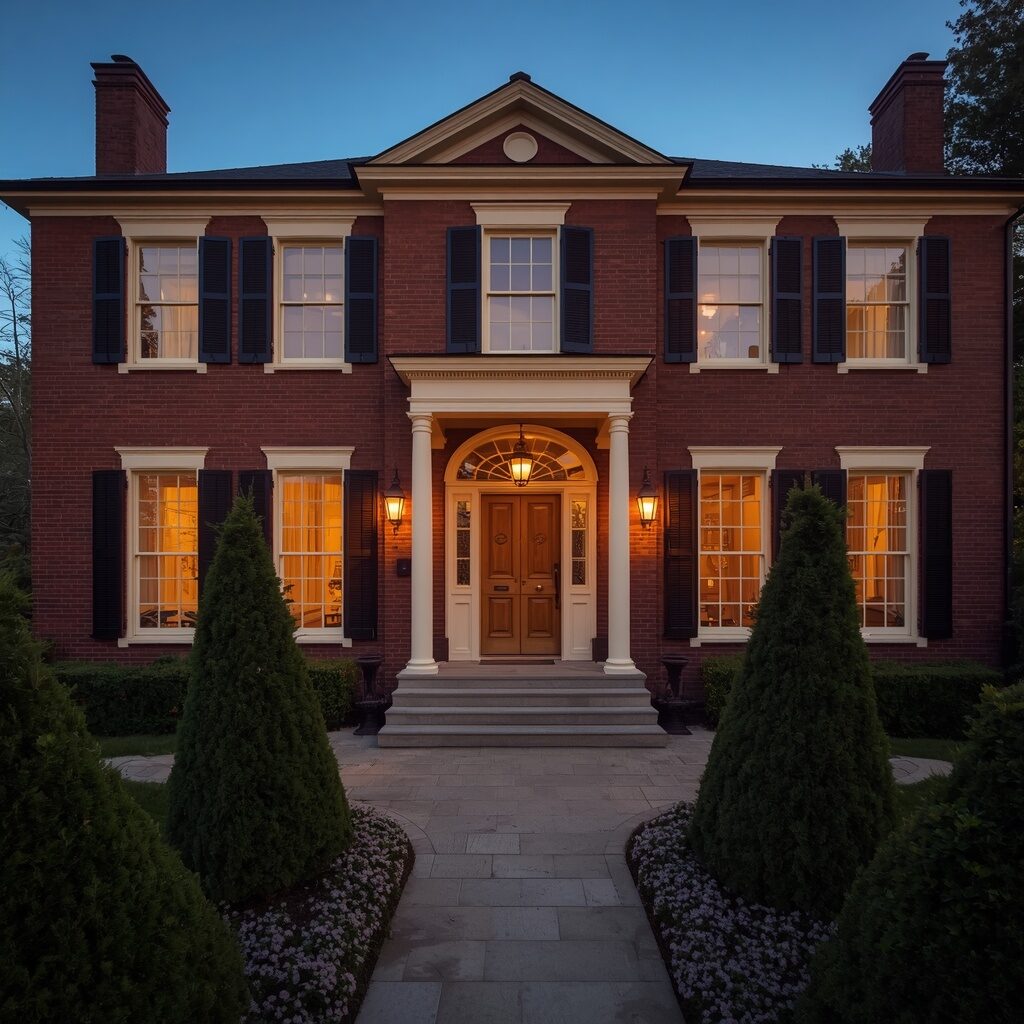
Deep plum delivers rich, regal luxury that instantly elevates your brick exterior into a true architectural showstopper. This dark, wine-toned purple feels sophisticated and daring, especially paired with cream trim, brass fixtures, and elegant boxwood landscaping for striking contrast. It’s a color that photographs beautifully in warm evening light, creating deep, rich shadows that feel almost cinematic in their drama and depth. Plum brick carries serious visual weight and presence, appealing to homeowners who want their home to feel like a genuine work of art rather than a typical suburban house.
This bold shade pairs exceptionally well with brass or gold hardware, elegant topiary landscaping, and soft purple or white floral accents. Deep plum feels particularly luxurious paired with warm lighting, creating a boutique hotel ambiance right at your own front door. Homeowners choosing this shade want maximum visual impact and are rewarded with a home that consistently stops traffic and sparks conversation. If rich, unforgettable luxury defines your dream exterior, deep plum luxury is a genuinely show-stopping and beautiful choice.
👉 ✨ Keep scrolling, the next ideas get even better!
26. Soft Oatmeal Neutral
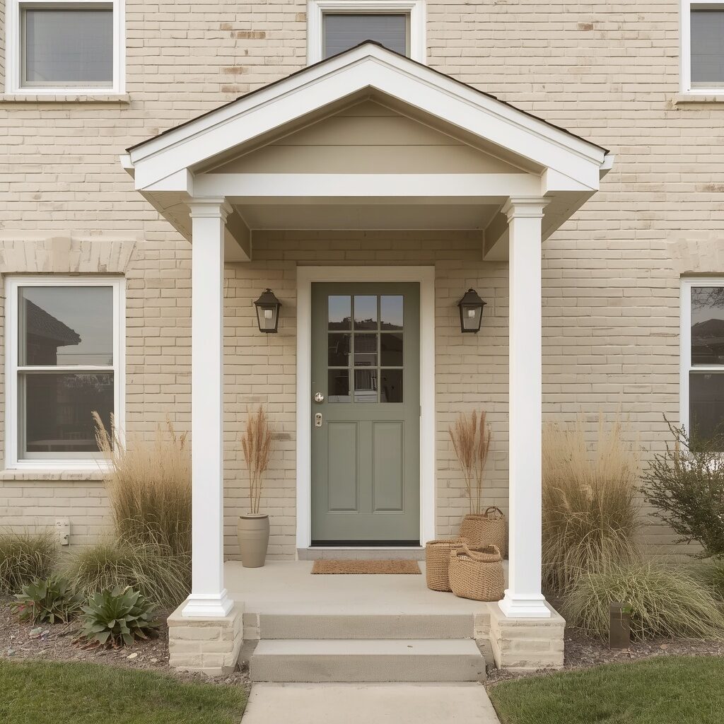
Soft oatmeal brings quiet, understated warmth to exterior brick, offering a neutral shade that feels cozy without ever demanding too much attention. This gentle, warm beige-gray tone pairs beautifully with white trim, sage accents, and natural textures like linen and woven baskets for a relaxed, grounded aesthetic. It photographs beautifully in soft, diffused light, holding warm undertones that feel calming and lived-in rather than cold or clinical. Oatmeal brick appeals to homeowners who want their exterior to feel effortlessly serene, like a quiet retreat from a busy world.
This shade pairs wonderfully with natural fiber textures, soft neutral landscaping, and simple, uncluttered porch styling for a minimalist yet warm look. Oatmeal feels timeless and versatile, working beautifully across farmhouse, coastal, and transitional architectural styles without ever feeling out of place. Homeowners are drawn to this shade because it creates an instant sense of calm the moment they pull into the driveway. If quiet, cozy neutrality defines your dream home, soft oatmeal neutral is a beautifully understated and comforting choice.
27. Bold Brick Red Contrast
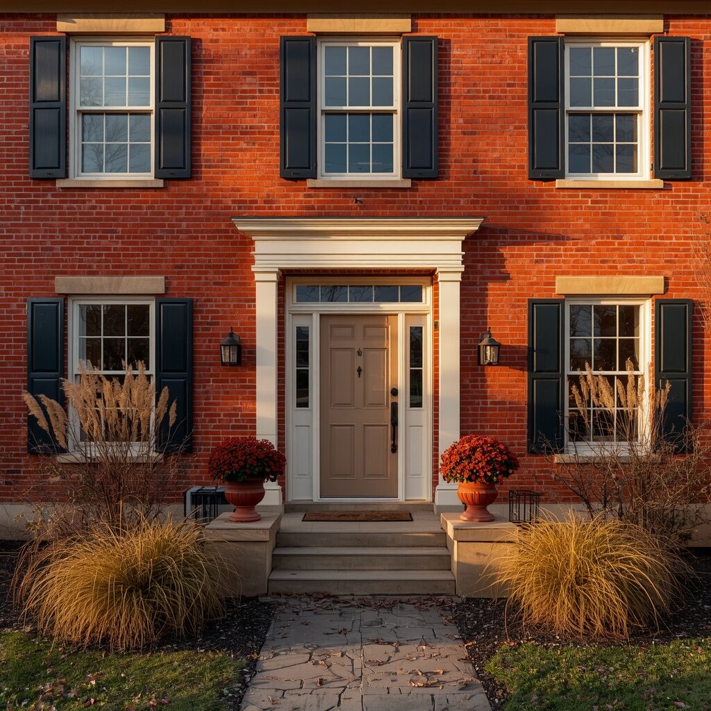
Bold brick red pays homage to brick’s natural roots while amplifying its warmth into something bolder, richer, and more intentional. This saturated red-orange shade feels grounded and confident, especially paired with cream trim, black shutters, and warm seasonal landscaping for striking contrast. It photographs beautifully during warm afternoon light, radiating rich, saturated tones that feel cozy and inviting throughout every season. Bold brick red appeals to homeowners who love their home’s natural material but want to amplify its warmth and character even further.
This shade pairs wonderfully with rust-toned landscaping, iron hardware, and terracotta planters for a cohesive, earthy aesthetic. Brick red feels particularly stunning during autumn, when surrounding foliage naturally complements the warm, saturated tone for a cohesive seasonal palette. Homeowners choosing this shade want a home that feels grounded, warm, and deeply connected to its natural material origins. If bold warmth and earthy richness define your dream exterior, bold brick red contrast is a beautifully confident and grounded choice.
28. Cool Silver Gray
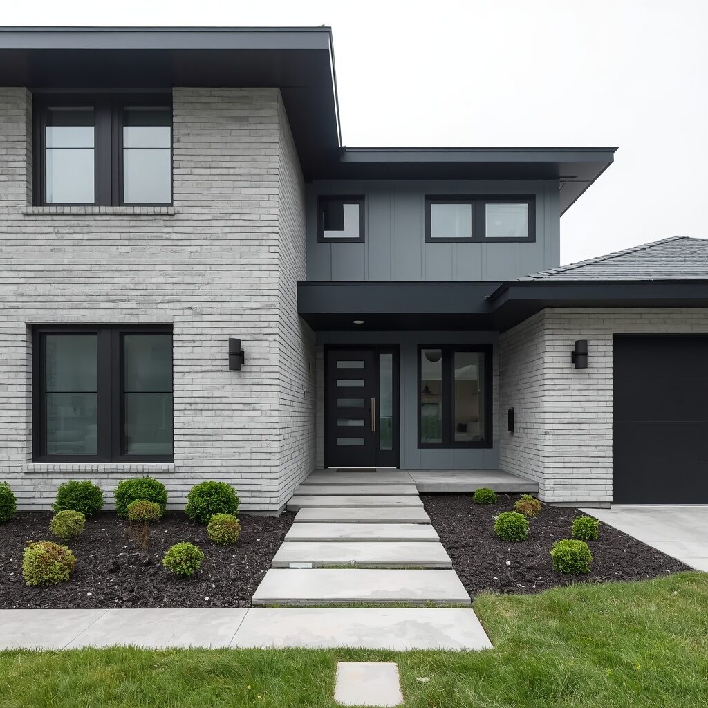
Cool silver gray delivers sleek, modern sophistication to exterior brick, offering a crisp, polished alternative to warmer neutral tones. This cool-toned gray feels contemporary and clean, especially paired with black trim, floor-to-ceiling windows, and minimalist landscaping for a cohesive architectural statement. It photographs beautifully under bright, overcast light, holding crisp, even tones that feel intentional and thoughtfully designed. Silver gray brick appeals to homeowners with modern or contemporary architecture who want their exterior to feel sleek, sophisticated, and effortlessly polished.
This shade pairs exceptionally well with matte black hardware, sculptural lighting fixtures, and clean, minimalist landscaping for a cohesive modern look. Silver gray feels particularly striking against greenery, creating beautiful contrast that highlights both the home’s architecture and surrounding landscape design. Homeowners choosing this shade want a home that feels current, clean, and architecturally significant without unnecessary ornamentation. If sleek modern sophistication defines your dream exterior, cool silver gray is an exceptionally polished and contemporary choice.
29. Warm Honey Gold
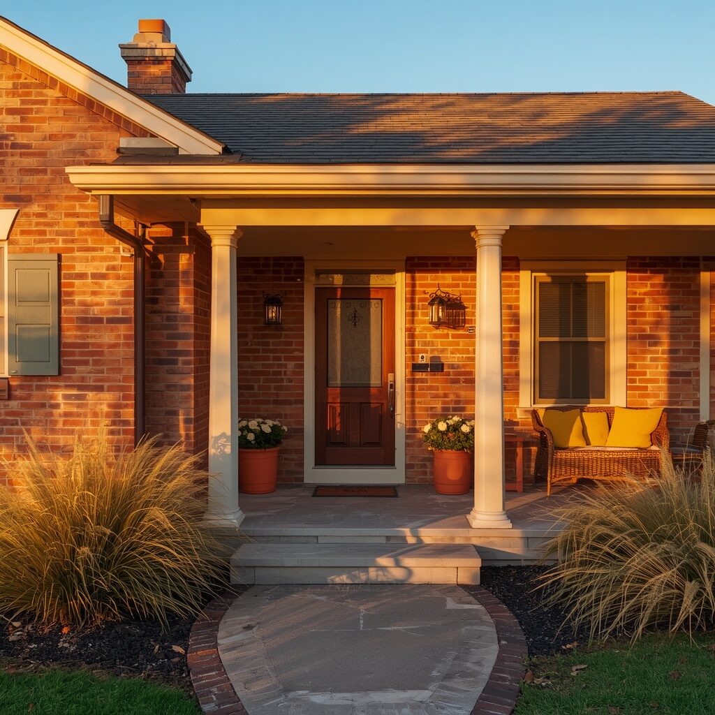
Warm honey gold captures pure sunshine within its rich, amber tones, creating a brick exterior that radiates comfort and joy in every season. This warm golden shade feels inviting and cheerful, especially paired with cream trim, walnut wood accents, and mustard-toned porch styling for cohesive warmth. It photographs stunningly during golden hour, when natural light amplifies the honey tone into something truly radiant and magical. Honey gold brick appeals to homeowners who want their home to feel like a permanent ray of sunshine, regardless of the weather outside.
This shade pairs wonderfully with golden ornamental grasses, terracotta accents, and warm woven textures for a cohesive, joyful aesthetic. Honey gold feels particularly stunning during autumn and golden hour photography, creating that coveted warm glow everyone chases for their Pinterest boards. Homeowners choosing this shade want their home to feel emotionally warm and genuinely happy every time they arrive. If radiant warmth and pure joy define your dream exterior, warm honey gold is a beautifully sunny and comforting choice.
30. Timeless Ivory Sophistication
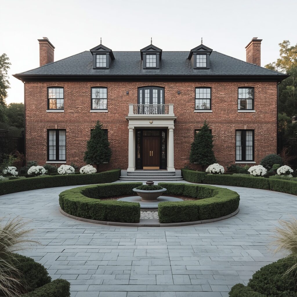
Ivory closes out this list as the ultimate blend of brightness and warmth, offering sophistication that feels both aspirational and completely timeless. This soft, warm white shade avoids the starkness of pure white while still delivering brightness and elegance to your home’s facade. It pairs beautifully with black trim, brass accents, and manicured landscaping for a polished, estate-like curb appeal that feels genuinely luxurious. Ivory brick photographs beautifully in nearly every lighting condition, making it a dream choice for homeowners and Pinterest content alike.
This shade appeals to homeowners who want maximum elegance without ever feeling cold, clinical, or overly trendy in their color choice. Ivory pairs wonderfully with boxwood hedges, brass hardware, and classic architectural landscaping for a cohesive, refined aesthetic. It creates an instant sense of arrival and sophistication, like coming home to your very own private estate every single day. If timeless elegance and warm sophistication define your ultimate dream home, timeless ivory sophistication is the perfect color to end this list on.
Related posts: 30 Fall Front Porch Ideas That Turn Ordinary Entrances into Stunning Seasonal Spaces
Conclusion
Choosing the perfect exterior brick paint color is one of the most rewarding ways to fall back in love with your home. Whether you’re drawn to the timeless elegance of crisp white, the bold drama of charcoal black, or the joyful warmth of honey gold, there’s a shade on this list that perfectly matches your personality and lifestyle.
Your home should feel like a true reflection of comfort, beauty, and personal style, and the right paint color can make that transformation happen almost overnight. From soft pastels to deep, moody tones, these 30 exterior brick paint color ideas prove that curb appeal truly starts with color, and every single option here is completely worth saving, sharing, and dreaming about.
👉 Which idea did you love the most?